Conversion rate optimization — CRO — is a fancy name for a simple idea: turn more of the visitors you already have into inquiries, calls and bookings. You do not need more traffic to grow. You need more of your current traffic to act.
For a small business, CRO has exactly one job: remove every reason a ready-to-buy visitor hesitates, and make the next step obvious. Everything below is a version of that one job.
What “conversion rate” actually means
Your conversion rate is the share of visitors who do the thing you want — send the form, tap the phone number, book the slot. If 100 people visit and 2 get in touch, that is 2%. Push it to 4% and you have doubled your inquiries without spending a cent more on being found. That is why CRO is the cheapest growth a small website has.
One clear call to action, repeated
The biggest leak on small-business sites is choice. Five buttons that all feel equally important means the visitor picks none. Decide the one action that matters — usually “request a quote” or “book a call” — and make it the loudest thing on the page.
- Say what happens next — “Get a quote within 24 hours” beats a bare “Submit”.
- Repeat it — the same button near the top, in the middle and at the end; people decide at different moments.
- One primary action per page — secondary links can exist, but only one thing should shout.
Speed and mobile: the foundation
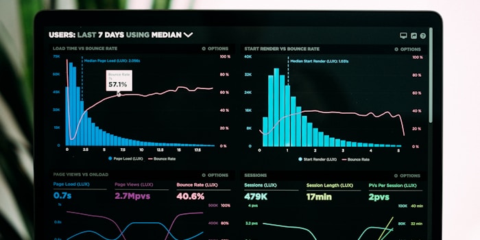
Nobody converts on a page they have already closed. Every extra second of load time quietly shreds your rate, especially on phones and mobile data — I wrote a whole piece on how a slow website costs you customers. And since more than half of local searches happen on a phone, a button too small to tap or a form that zooms awkwardly loses the sale on the device most people use. That is why I build mobile-first rather than mobile-as-an-afterthought. Treat speed and mobile as the ground everything else stands on.
Shorter forms, more inquiries
Every field you ask for is a small tax on the visitor’s patience. Most small businesses can qualify a lead with three: a name, a way to reach them, and a line about what they need. Phone number, company, budget dropdown, “how did you hear about us” — each field you cut lifts completion, and you can always ask the rest in your reply. A visible note like “takes 30 seconds” next to the form nudges the hesitant over the line.
Trust signals and benefit-led headlines
A stranger will not hand you their project until something on the page vouches for you — and until the headline convinces them they are in the right place. The reliable builders:
- Real reviews with names — three specific, believable ones beat twenty anonymous stars.
- Real photos of you and your work — faces and finished jobs, not stock handshakes.
- Clear pricing or “from” ranges — a number signals confidence; silence reads as “expensive”.
- Headlines about the customer — “Boiler repaired the same day across Graz” beats “Welcome to our website” every time.
How to test changes without fancy tools
You do not need an A/B testing suite. Change one thing at a time — a headline, the CTA wording, a shorter form — and watch two numbers for two to four weeks: inquiries received, and inquiries per visit. Keep what lifts them, revert what does not, and note the date of each change so you can tell what caused what. That simple loop, run monthly, outperforms most agencies’ dashboards. And because you only ever change one thing, you always know exactly which change earned the lift.
You rarely need more visitors. You need to stop losing the ones you already have.
Where to start
Pick the two changes above that feel most obviously broken on your site today — usually the call to action and the form — and fix those first. If you want a second pair of eyes, especially for a small-business site that has to earn its keep, see what a focused rebuild would cost or tell me what is not converting and I will point you at the highest-leverage fix.